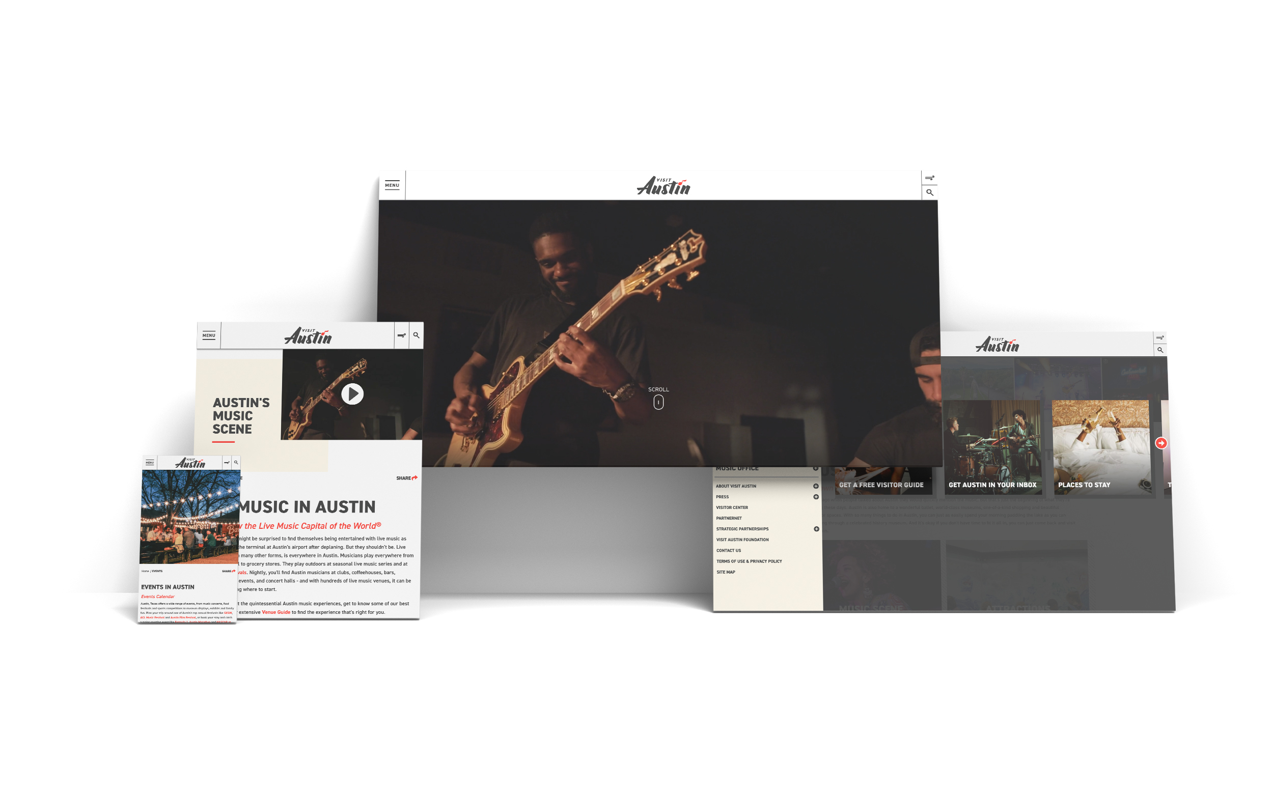
It’s not called the Live Music Capital of the World for nothing. Austin hosts more live music venues than you can shake a stick at. The city is known for being a rich and eclectic community of musicians, artists, and entrepreneurs. Visit Austin needed a website that would not only reflect this spirit, but would also be able to grow along with it. Their brand is tight and I am not taking about just how cool it is. A single logo, two colors, a single type family, and a library of photography were all that could be used when designing the site. Visit Austin has taken great lengths to promote and strengthen their brand look and feel. The website would be an extension of this brand, if not its spokesperson. Visit Austin wanted to inspire and educate new and returning visitors through an engaging and intuitive way. Photography and clear calls to action we required to entice the visitor to explore the site as well as to increase their time interacting with the site.
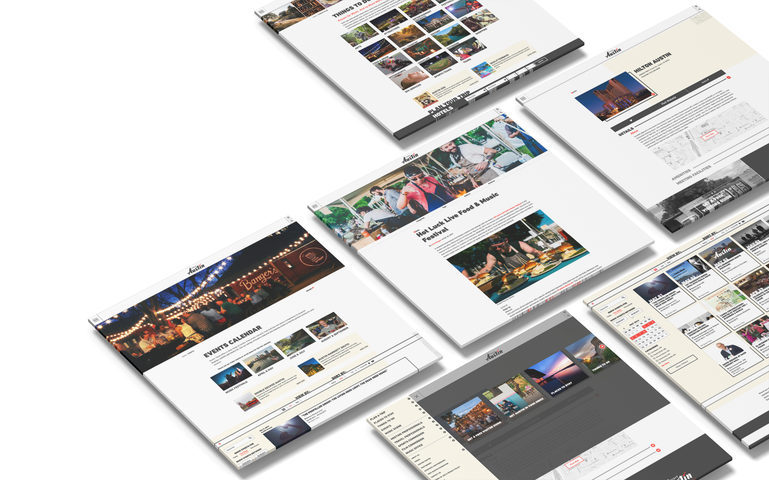
Being a tech-savvy destination, we were able to push the envelope in terms of functionality and design. A strong focus on content and how it would be delivered was the deciding factor with the design. A mobile inspired sticky navigation was used to promote exploration, but was also a way to showcase promotions and attractions. The site’s visual narrative was one that utilized larger imagery and bold use of typography to demonstrate the character of Austin. Since their brand was minimalist by design, we used this to our advantage. An extreme focus on photography is the overlying trope throughout the site. To help support the photography, we utilized the typeface’s extended family and used only three variants to keep the site from being too complicated. Color was also used minimally, Black was the overall choice, but used in a way where the color of the site was reflected in the photography. A red and neutral color were added to enhance links and create background anchor objects. Inspiration came with unique ways to navigate the site as well as intuitive tools designed specifically for site engagement and sessions. Large full screen widgets were created to entice visitors. The overall layout was designed to invite the visitor to willingly scroll through the pages. Pops of color pepper the site to allow the user to interact with the site and go deeper to find even more enriching content. Bold calls to action in forms of headlines and buttons were designed to be integrated within the widget, but clear enough so that it would not distract the visitor’s eyes.