Nacogdoches is deeply rooted in its history and heritage. It is a place to enjoy the connection to times past and new beginnings. It is a place to get away for a bit, a welcome opportunity to explore an authentic town and get a real Texas experience. The emotional value that the destination brand taps into is connection, a sense of pride in being the oldest town in Texas.
The logo had to capture the authentic pioneering spirit of the city. It had to be proud, but not arrogant. Rooted in history, but not ancient. Peaceful, but not sleepy. Genuine, relaxed, eclectic, and timeless.
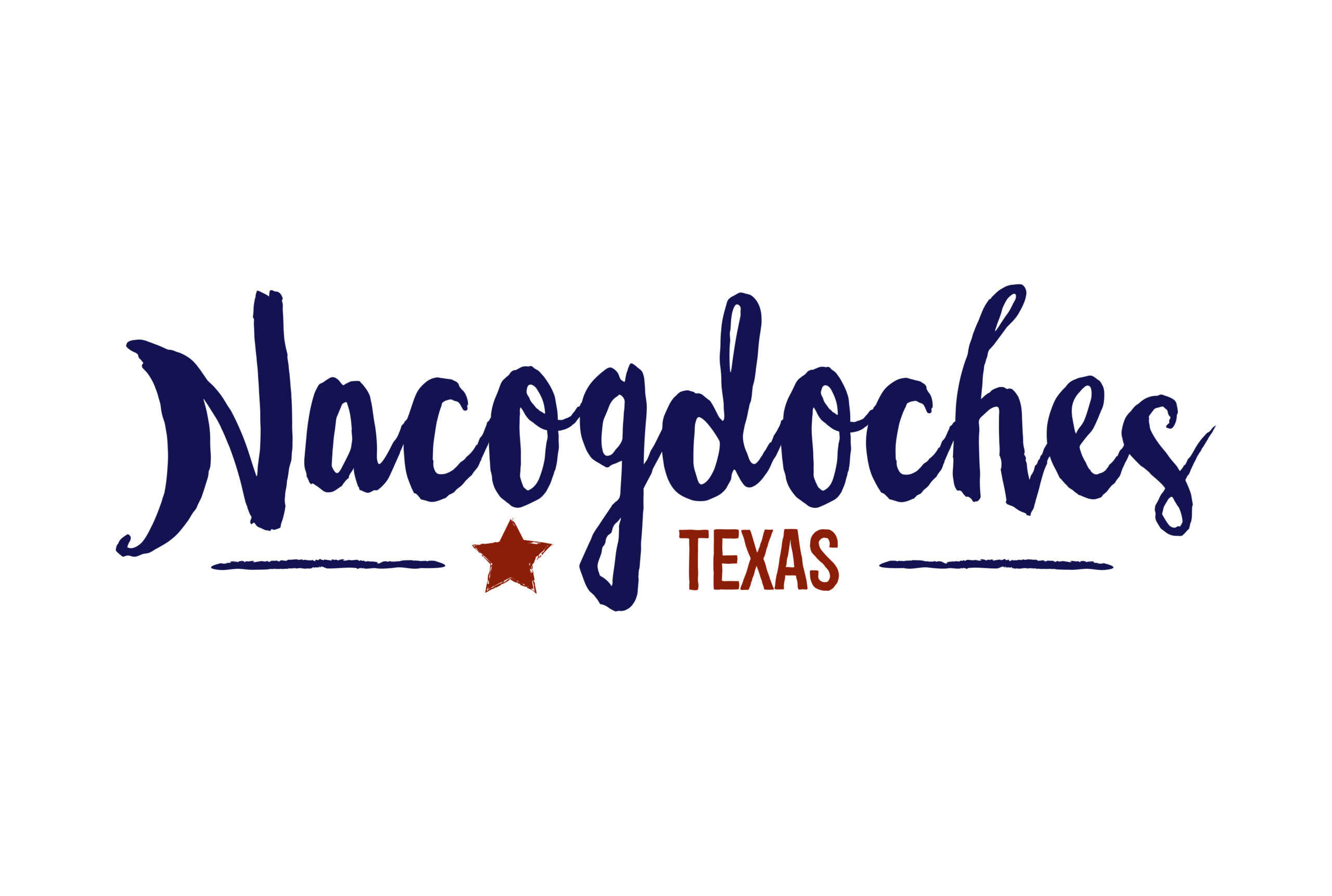
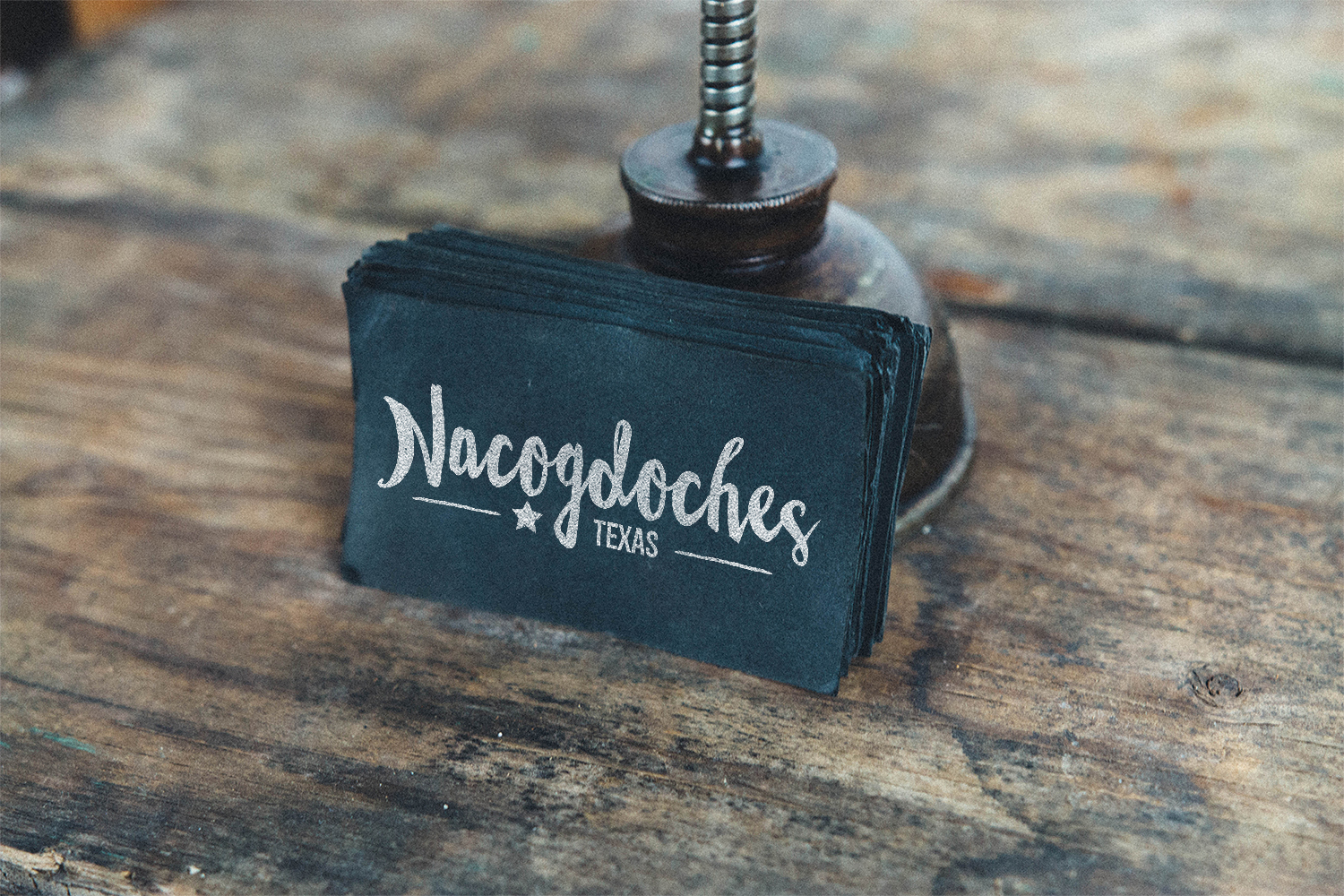
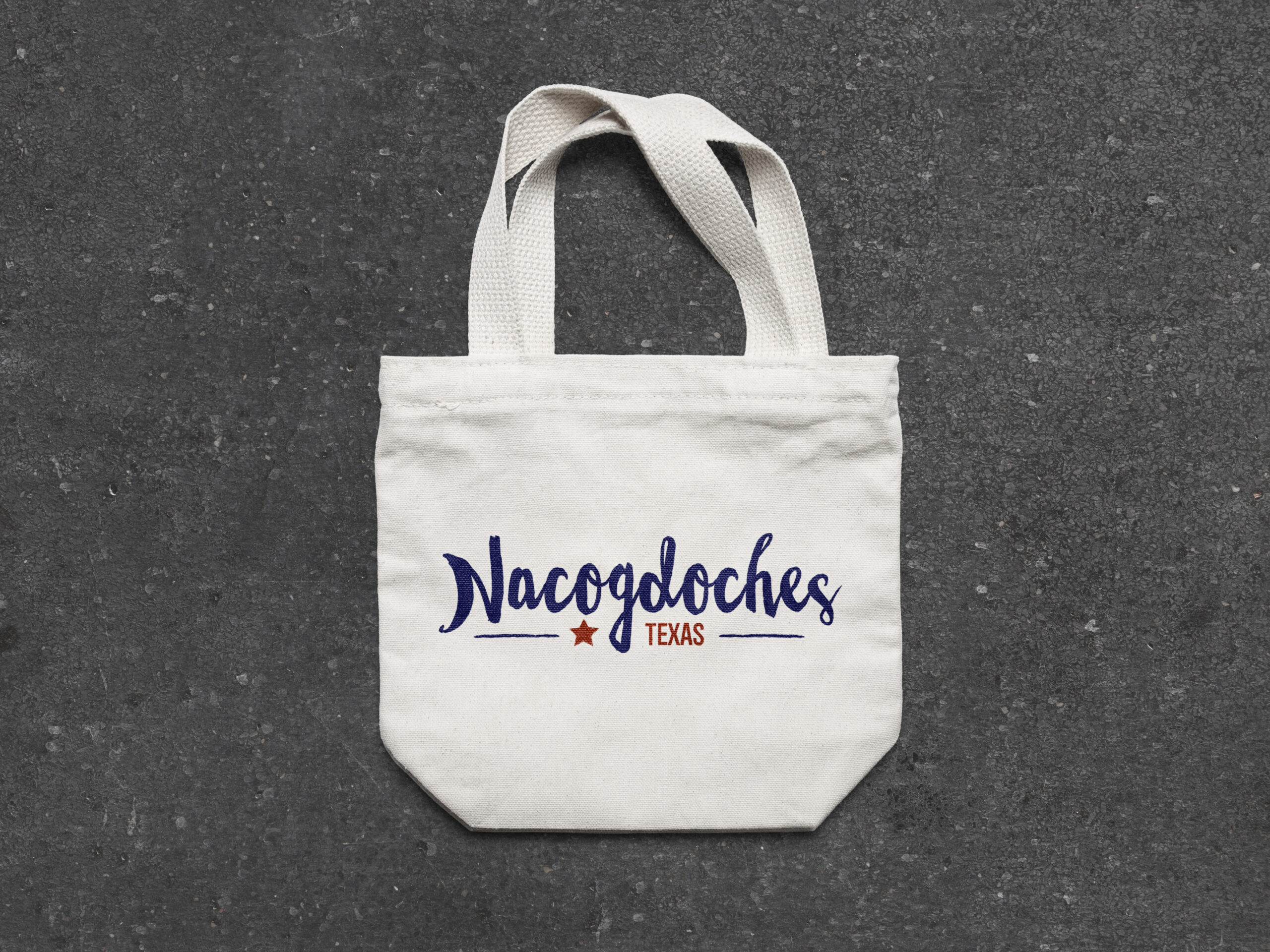
I approached the logo from a perspective of history. Being the oldest town in Texas, it has seen some things. I chose to use a logo type for my direction as well. I wanted something that would immediately identify the the destination with history and Texas. I started off with a script typeface to capture the look of being genuine, peaceful, relaxed, but it also helped ground the mark as more historic – we don’t even teach cursive in school nowadays. Its Texas, the Lone Star State, I added a stylized star to the mark as well as a the word Texas to balance each other. Finally, borrowing from the Texas flag, I added colors to the logo to solidify the mark’s Texas roots.