South Haven is a step away from the pressures of ordinary life to a place where fundamentals matter most: family and loved ones, sunshine and water, food, fun and relaxation. True to its name, South Haven is a refuge and a hideaway — a place to unplug and get back to your authentic self, leaving behind your job, worries and stress. Combining unspoiled beach beauty with old-fashioned charm, South Haven offers families and couples an idyllic lakeside escape: easy to get to and impossible to forget.
A Lake Michigan coastal village that boasts its beaches as its most important visitor interest, the South Haven logo had to capture a beachside escape, a place to get away and relax, and a setting that makes it easy to let go and rediscover your happiness.
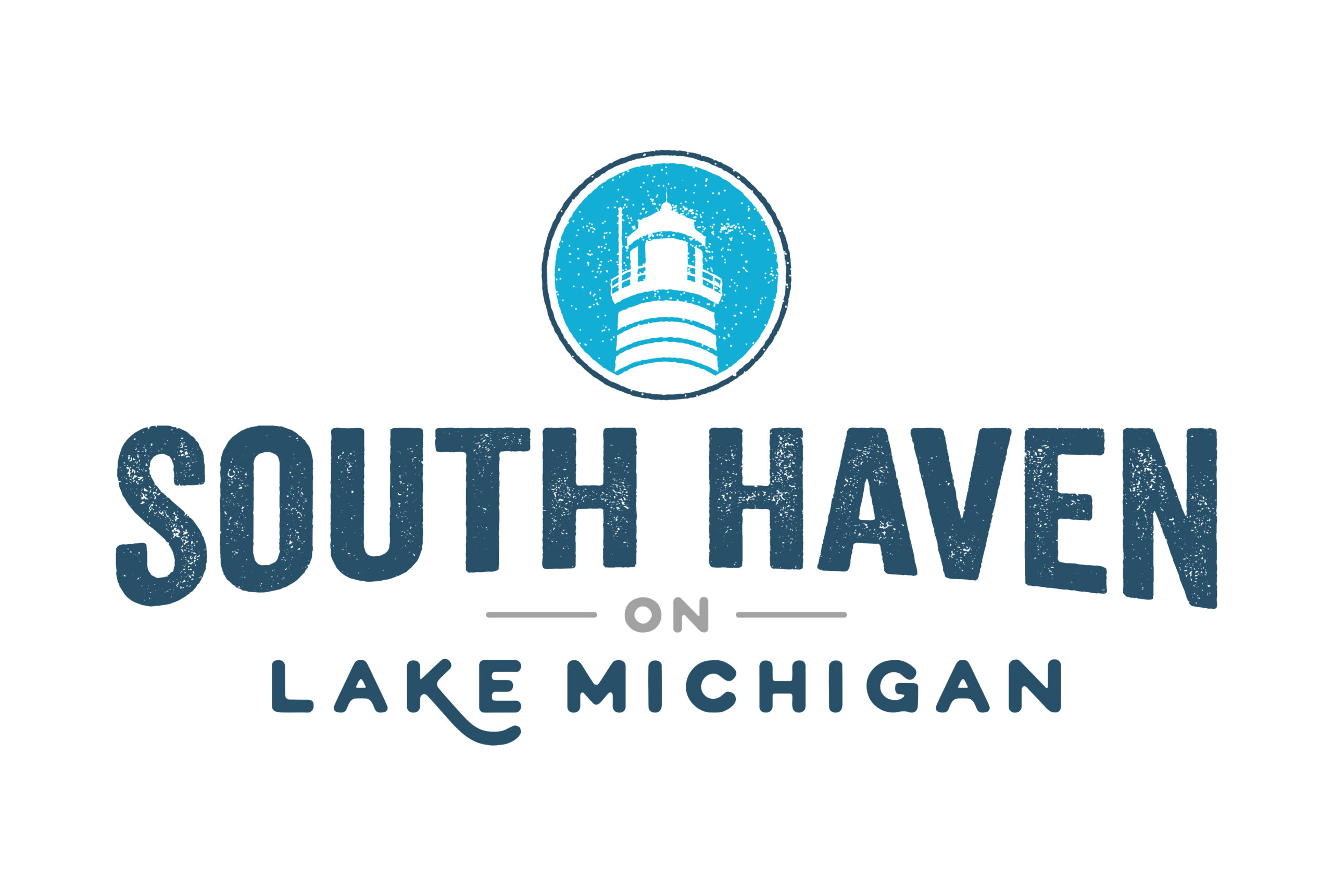
Lake Michigan is one of our nation’s 5 inland seas, the waters there can be treacherous and this is where the South Pierhead Light comes into play. I choose to use the iconic lighthouse has my main focal point of the logo. With a distinctive look, the lighthouse was the perfect mark for a logo. Following the mark, I wanted typography that would be bold but evoke a sense of place. I also distressed both the mark as well as the logo type to convey as sense of being weathered, something all coastal towns become over time. The colors chosen were cool, calm, and inviting; exactly like South Haven itself.