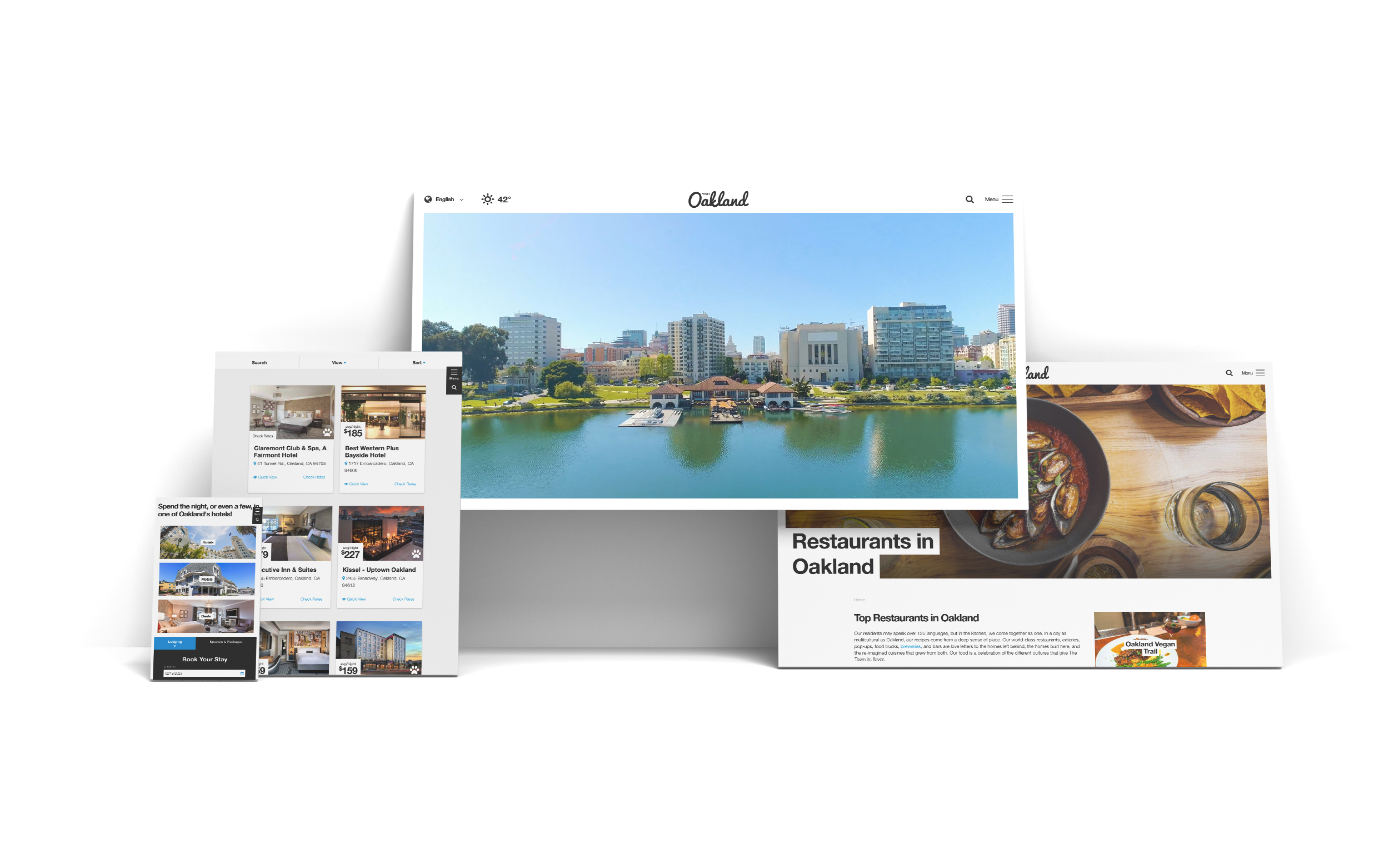
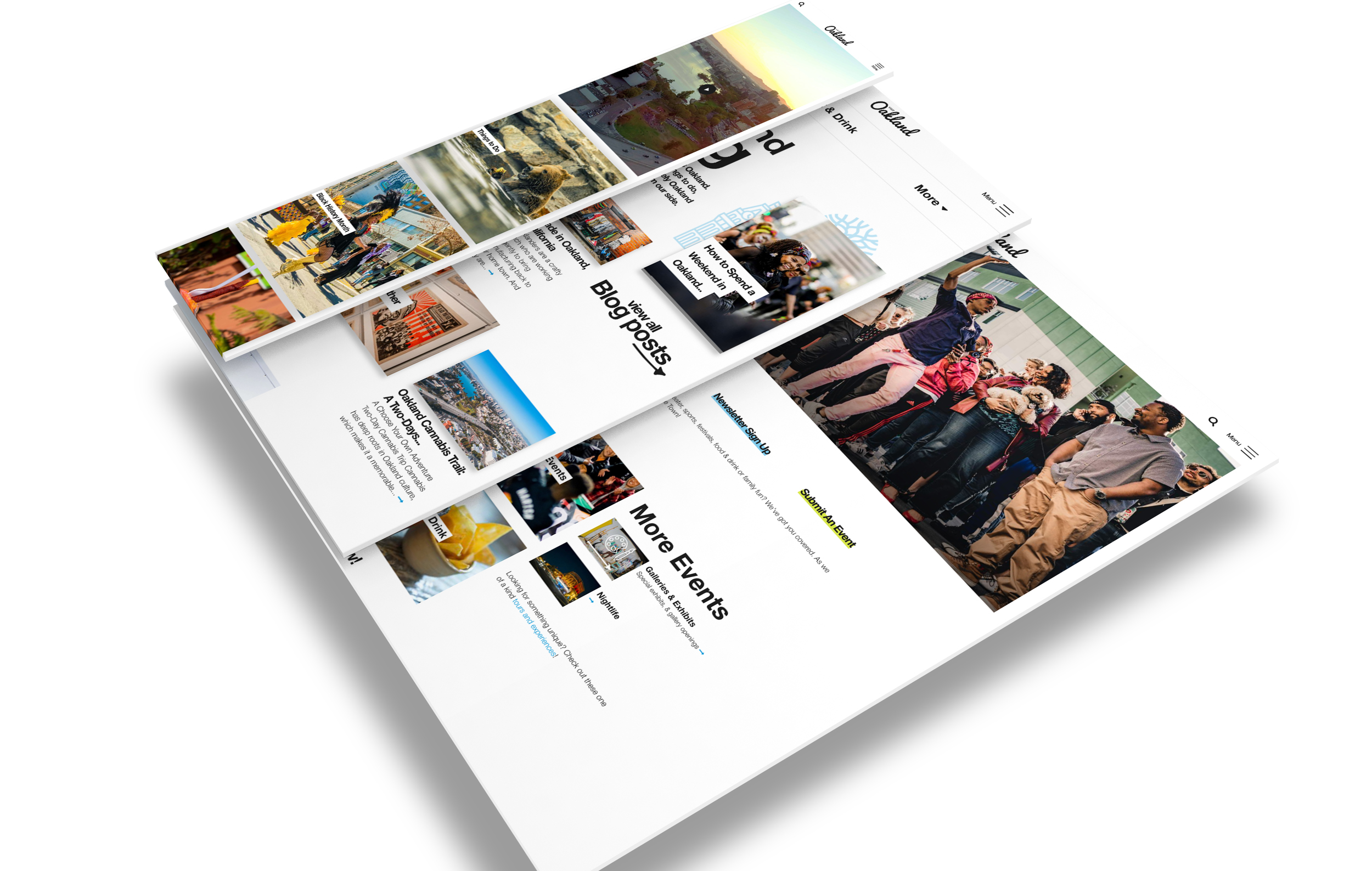
The East Bay has entered its own renaissance of arts, culture, food, and burgeoning attractions. Unique to itself and its surrounding areas, Oakland, has its own identity and its own presence that is completely different than its bay area neighbor. Grounded in a blue collar environment, the city is attracting new interest in business as well as travel.
Describing themselves as “pretty-gritty,” the new and improved Oakland site had to capture that blue collar spirit while highlighting the city’s urban aesthetics. The established brand guidelines had to be used as guide, but open to interpretation.
Strong visuals supported by clear calls to action and an emphasis on usability played an integral part in the overall site design. Helvetica, being the work-horse font that it is, was used as the site primary typeface as well as a harkening back to Oaklands blue collar roots. Focusing only on black and white, the site was was able to use the brand colors as accents that were able to act as support to the content and to the images.